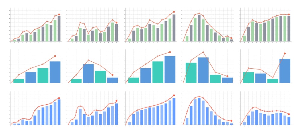
Data Visualization In Statistics: Graphs, Charts, Surface Response Diagrams, Counterplots are effective visual tools to present and understand the direction of distribution of data in an experimental study.
Sometimes, data can be better understood when presented by visual Charts/Graphs than by a table because the Charts/Graphs can reveal a trend or comparison.

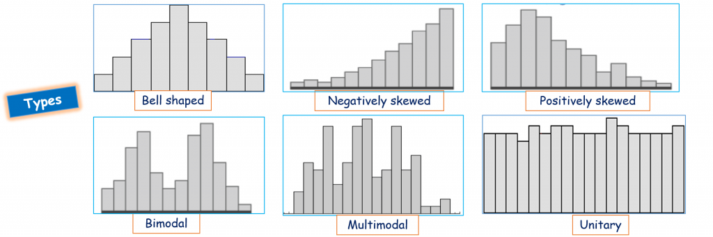
Histogram:
Table of Contents
- The Histogram is a popular graphical tool used to represent numerical data distribution.
- It was first introduced by Karl Pearson.
When to use
- The data are numerical.
- To see the shape of the data’s distribution.
- Determining whether the output of a process is distributed approximately normally.
- Analyzing whether a process can meet the researcher’s requirements.
Applications
- It is used to summarize discrete or continuous data that are measured on an interval scale.
- It is often used to illustrate the major features of the distribution of the data in a convenient form.
- The histograms are used to display and organize a large set of measurements or numerical data in a user-friendly manner ( greater than 100 observations).
- It can help detect any unusual observations (outliers) or any gaps in the data.
- A histogram divides up the range of possible values into a data set into classes or groups.
- A histogram will make it easy to see where the majority of values fall on a measurement scale, and how much variation is there among those values.
Construction
- To construct a histogram, the first step is to sort the range of values viz., divide the entire range of values into a series of intervals.
- Count how many values fall into each interval.
- The sorted values are usually specified as consecutive, non-overlapping intervals of a variable.
- For each group/variable, a rectangle is constructed with a base length equal to the range of values in that specific group and a length equal to the number of observations falling into that group.
- Generally, a histogram will have bars of equal width.
Pie Chart:
- It is also called a circle chart where the chart is in the form of a circle divided into a series of segments.
- Each segment represents a particular category/variables /observations/items.
- The area of each segment is the same proportion of a circle as the category/variables /observations/items is of the total data set.
- A pie chart is a way of summarizing a set of nominal data or displaying the different values of a given variable (e.g. percentage distribution).
Applications
- Pie charts are one of the most commonly used charts because they are simple to use.
- The use of the pie charts is quite popular, as the circle provides a visual concept of the whole (100%).
- A pie chart uses percentages to compare information because they are the easiest way to represent a whole. The whole is equal to 100%.

Advantages
- The picture is simple and easy to understand.
- Data can be represented visually as a fractional part of a whole.
- It helps in providing an effective communication tool for the even uninformed audience.
- Provides a data comparison for the audience at a glance to give an immediate analysis or to quickly understand information.
- No need for readers to examine or measure underlying numbers themselves, which can be removed by using this chart.
- To emphasize a few points you want to make, you can manipulate pieces of data in the pie chart.
Disadvantages
- It becomes less effective if there are too many pieces of data to use. Even if you add data labels and numbers may not help here, they may become crowded and hard to read.
- As this chart only represents one data set, you need a series to compare multiple sets. This may make it more difficult for readers when it comes to analyzing and assimilating information quickly.
- They are best used for displaying statistical information when there are no more than six components only – otherwise, the resulting picture will be too complex to understand.
- Pie charts are not useful when the values of each component are too similar because it is difficult to see the differences between slice sizes.
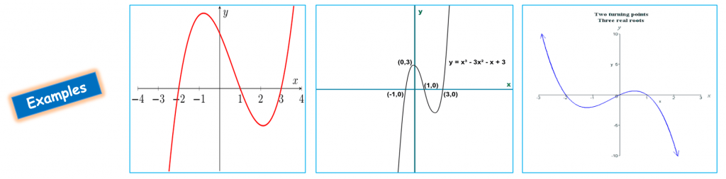
Cubic Graph:
- A Cubic graph is a graphical representation of a cubic function, in which all vertices have degree three.
- In other words, a cubic graph is a 3-regular graph, it has two turning points a minimum point and a maximum point. Cubic graphs are also called trivalent graphs.
Properties
- Cubic graphs often have different scales on the x-axis and the y-axis.
- Carefully plotting the coordinates.
- The curve must be smooth- Cubic graphs need to be drawn with a smooth curve.
- Avoid straight line segments.
- Cubic graphs only 2 turning points
- Make sure that the cubic graph has only one minimum point and one maximum point.
- Check that the correct values and have plotted them accurately.
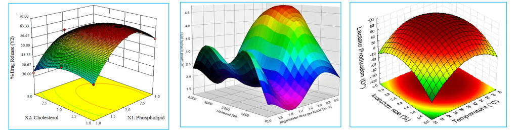
Response Surface Plot:
- Response Surface plots are diagrams of three-dimensional data, show a functional relationship between a designated dependent variable (Y), and two independent variables (X and Z).
- These are the type of statistical graphs used in the analysis of experiments because the response surface is visually appealing and provides a quick meaningful overview of the relationship.
- These plots are used when a stored model and wants to plot how the response relates to two continuous variables.
- A response surface plot contains the following elements,
- Predictors on the x and y axes.
- A continuous surface that represents the fitted response values on the Z-axes.
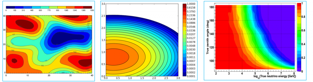
Contour Plot:
- A contour plot is a graphical technique for representing a 3-dimensional surface by plotting constant z slices, called contours, on a 2-dimensional format.
- That is, given a value for z, lines are drawn for connecting the (x, y) coordinates where that z value occurs.
- The contour plot is an alternative to a 3-D surface plot, it allows to visualization of three-dimensional data in a two-dimensional plot.
- Contour lines commonly show response, but they can also be used to show the extent and direction of the response.
- Contour plots display the results of a single data set over the model geometry.
- The range of values in the results set is divided into several subranges, and each subrange is assigned a color.
- The colors are then mapped over the geometry to indicate the result values at each location in the model.
- There are three important display options for contour plots viz., undisplaced shape key, the scale factor, and the contour scale.
Make sure you also check our other amazing Article on : Statistics And Biostatistics